Data on the move
Advancements in data technology are changing the way we approach design and planning. The use of data analysis to improve performance has become common practice in various fields from healthcare, to sports, to product design, marketing, etc. As humanity faces more and more complex challenges in an increasingly fast-paced society, data visualization becomes a powerful tool to help with decision making and strategic planning across scales and industries. As we become more and more conscious about the social and environmental impact of our actions, we need ways to measure, assess, and analyze our performance and footprint, in a dynamic and visual way.
The convergence of emerging technologies such as artificial intelligence (AI), distributed ledger technology (DLT), and the Internet of Things (IoT), is offering a myriad of opportunities for a sustainable data-informed transformation of cities. In many ‘smart cities’ around the world, ground-breaking open data infrastructure is leading to a new form of digitally-enabled democracy, making use of data as a public resource. Evidence-based policy making is revolutionizing the social and environmental performance of city sectors such as transportation, energy, waste management, housing, water, food, etc.
This article looks at data harvesting as a game-changer in city planning. The following paragraphs dive into some case studies in which mapping, visual representation, and machine learning are turning numbers into ground-breaking sustainable design insights.
Smart urban mobility

Advancements in artificial intelligence, connectivity levels and the internet of things are opening the door to a new form of transportation design: smart, autonomous transportation. From driverless cars, to flying drone deliveries, the future of transportation seems to offer quite game-changing features, and is not so far ahead. This is opening the door to more fluid and sustainable waste collection systems whereby instantaneous data and on-demand automated routing can change the status-quo in certain neighborhoods. The below case-study exemplifies the use of live data visualization and dynamic mapping for the design of the smart mobility systems of tomorrow.
In Amsterdam, researchers from Amsterdam Institute for Advanced Metropolitan Solutions in partnership with the Senseable City Lab of MIT have been working for 5 years now on ‘Roboat’: the world's first fleet of autonomous floating vessels. The project investigates the potential of self-driving technology to change our cities and their waterways through a new kind of on-demand infrastructure: autonomous platforms will connect to form floating bridges and stages, collect waste, deliver goods, and transport people, all while collecting data about the city. Their research ‘Waste Streams’ explores the use of autonomous boats for waste management in the historic center of Amsterdam, where the fixed receptables of waste cover only a fraction of the district's needs, and requiring curbside garbage pickup, which crowds the narrow city streets. ‘Waste Streams’ proposes to start using the canals for the collection of waste, through a system of automated mobile waste collection cans and boats. Through this project, the team aims at tacking the urban household and hotel waste issue of congested Amsterdam.
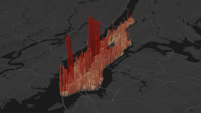
Current realtime data technologies and mapping systems are opening the door for an animated kind of data visualisation, one that allows to track the progress over time and understand it in cycle. In 2018, researcher Justin Fung created this interactive mapping of New York City’s daily migrations, called The Invisible Heartbeat of New York City. Using Mapbox and D3, and by compiling different datasets (from the 2010 Census, the MTA’s turnstile database, and a previous NYU study, ), he created block-by-block estimates of Manhattan’s population hourly changes of locations throughout the week. The red bars reveal the population of a specific block; the darker the red the denser the population is in the highlighted areas.
The New York City subway is a constantly evolving network, hard to grasp without the use of maps and diagrams. MTA has recently released an application for interactive mapping and realtime data visualization of the subway system, its trains, schedules, stations, etc. Created by digital product agency Work & Co, the ‘Live MTA Subway Map’ combines graphical characteristics of the two most famous NYC subway maps in history: Vignelli’s elegant simplified version and Hertz’s richer and more accurate version.
In 2020, the pandemic has led to a shift in transportation patterns, with a noticeable increase of human-powered mobility. Sports app Strava is witnessing this first-hand through its mapping engine ‘Strava Metro’, which aggregates the routes taken by its users into a dynamic heat-map representing the ‘world’s largest collection of human-powered transport information’. Strava is making this geospatial information available to urban planners and advocacy groups to help improve the infrastructure of cities and usher in a new chapter in sustainable transportation.
Healthcare
With the fast spread of Covid-19 and the need to find ways to limit contamination and plan healthcare systems accordingly, many statistical analysis and mapping engines have been put to use. The above mapping is a tool used by the Center for Systems Science and Engineering (CSSF) at John Hopkins University (JHU). This data-driven approach to healthcare management and research presents very valuable insights, particularly in the case of the coronavirus — a novel infectious disease spreading at a fast pace.
Air quality
Advancements in sensor technology, like miniaturization of hardware, data transfer speed and increasing storage capabilities have led to a new wave of satellites specially built for tracking pollution and pinpointing sources of emissions.
This ESA Mapping Portal uses data from the Copernicus Sentinel-5P satellite and shows the averaged nitrogen dioxide concentrations across the globe displayed with intervals of a 14-day moving average. The above screen-recording highlights the effects of the 2020 pandemic lockdown on global air pollution, by comparing a similar segment in 2019 and 2020, with a focus on Europe. The mapping is done using OpenStreetMap, Leaflet, CartoDB and Sentinel Data S5P5.
Energy
In an attempt to raise awareness about global energy impact, the site GoCompare.com has compiled this breakdown of the world’s electricity by source: fossil fuels, renewables, and nuclear. This interactive map provides a macro reading of the energy industry as well as regional and national statistics visualized through the map. This info is overlaid on a custom tile layer, which is a composite of 400 satellite images from 2012, depicting the lights around the world, at night. The bright spots help understanding the distribution of population, as well as what areas of the world are generally wealthier and more urban. Meanwhile, the big dark spots as noticed over the wilderness in northern Canada, the Amazon basin, or in Niger, show areas that are not densely populated or more rural.
US Electricity Sources is an interactive map created by the researchers Simon Evans and Rosamund Pierce for Carbon Brief using Leaflet and satellite imagery. This colorful map explores, in details, the sources of United States’ electricity and how much energy is generated. Color-coded by type, the circle size indicates the power output generated by each individual power source. This interactive map helped in assessing few important observations among which the fact that planned new power plants are almost exclusively gas, wind or solar. In addition to that, the continuously changing US electricity system reflects not only federal policy, but also technologies, geographies, markets and state mandates…
Supply chain
With the emergence of distributed ledger technologies, also commonly referred to as the blockchain, new levels of traceability, transparency, and transactional mapping becomes feasible. This project conducted as a partnership between Sourcemap and Provenance presents a new form of supply chain mapping for consumer goods. Food and fashion brands have now the capacity to portray through these dynamic and verified maps and diagrams the origin and step-by-step journey of their products validated by track verified claims.
Water
Dynamic computational mapping can also be used to simulate potential case scenarios. In this report by Climate Central, sea level rise simulations are plotted in a comparative interactive of 4 degrees and 2 degree Celsius temperature rises scenarios. The study maps out the cities that will be most affected by climate change, and raises awareness about the imminent impact on communities. Part of the Surging Seas analysis, the mapping uses Google Earth to compute the effects of rising water levels on cities around the world. They are also based on forecasts published in the academic journal Proceedings of the National Academy of Sciences of the USA.
Climate
When it comes to predicting climatic behaviors, satellite imagery is of utmost value and importance. The increasing amount of satellite data is opening the door to new smart mapping techniques, made available through cross-platform geospatial visualization systems such as deck.gl-native, a GPU-powered geospatial visualization framework for large-scale geospatial data, and Google Earth Engine, a tool that combines a multi-petabyte catalog of satellite imagery and geospatial datasets with planetary-scale analysis capabilities and makes it available for scientists, researchers, and developers to detect changes, map trends, and quantify differences on the Earth's surface.
The above map, for instance portrays temperature variations loaded from an Earth Engine ImageCollection and displayed as an animation using the deck.gl EarthEngineLayer.
Geography
Unfolded - a geospatial analytics platform for data unification, enrichment, and visualization - helps combine, aggregate and correlate datasets with different boundaries using a hexagon-based spatial indexing removes barriers between geospatial shapes. The above map, for instance, created using Unfolded, represents the tree heights across the united States at a 1km resolution based on satellite imagery dataset provided by Google Earth engine.
Emergency Response
Google’s algorithmic polygon drawing process using data from NOAA's GOES satellites and Google Earth Engine
Realtime satellite data imagery and analysis offers the possibility to improve emergency response systems. For instance, in the case of wild-fires, storms, and other rapidly spreading threats, satellite imagery paired with search engines and social media outreach can save lives by spreading the right information at the right time. Google has recently launched Google Emergency for that specific purpose. Through its technology, it is able to translate the raster imagery of satellite info into vector-based simulations of the threats and implement that into google maps and google search engine for fast sharing of the safety measures information.
As our world becomes more and more connected, data is increasingly being harvested as a productive public resource. Offering new possibilities for city planning and design, these smart mapping systems are providing amazing insights for evidence-based policy making, performance-optimized infrastructure and information sharing. As the IoT, AI, and Blockchain technologies continue to advance at a rocketing pace, while the world population is demanding more and more justice, transparency and accountability, one could come to wonder: could a new form of engaged democracy emerge from these interactive realtime systems?
Let’s hope for it :)
by Joanne Hayek & Hussein Zaarour
Find the article on Medium